

Detroit Institute of Arts
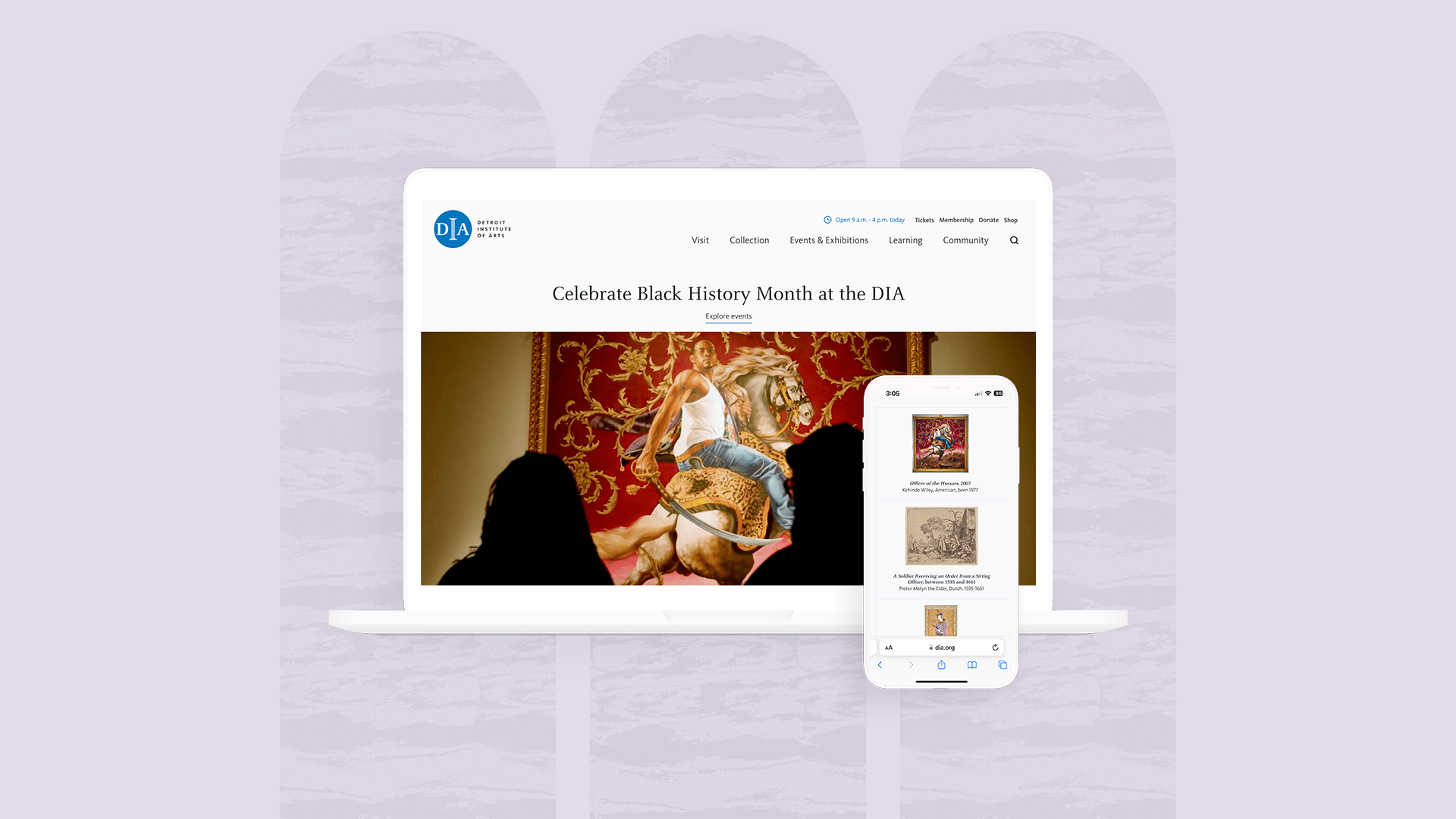
The Detroit Institute of Arts, home to one of the top six U.S. art collections, including Rivera’s Detroit Industry fresco and the first Van Gogh acquired by a U.S. museum, partnered with Purple Rock Scissors to redesign its website. I led the design, reimagining the collection experience, simplifying visit planning, and reflecting the museum’s community impact.
Vision

The final product began with a clear vision defined during the discovery phases of the project and visits to the DIA. This vision was summarized by the following three areas of focus:
Beauty
We cultivated an inspired aesthetic with an elevated usage of an established brand, space for art to speak for itself, and details that brought the grandeur of the DIA into the digital space.
Access
Planning for WCAG 2.0 compliance provided fantastic opportunities to innovate and create beautiful, functional solutions that reach people, exposing them to the wonder of DIA’s collections, space and programs.
Renewal
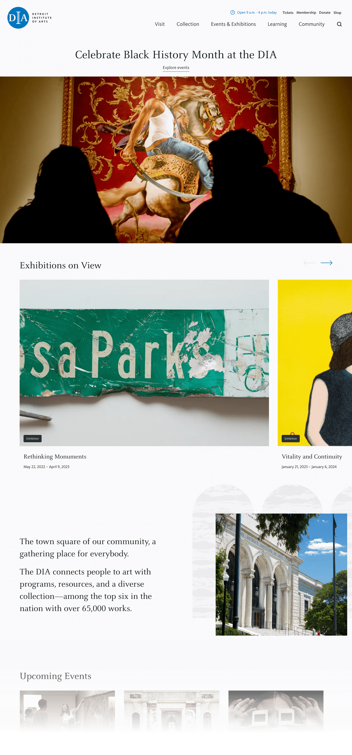
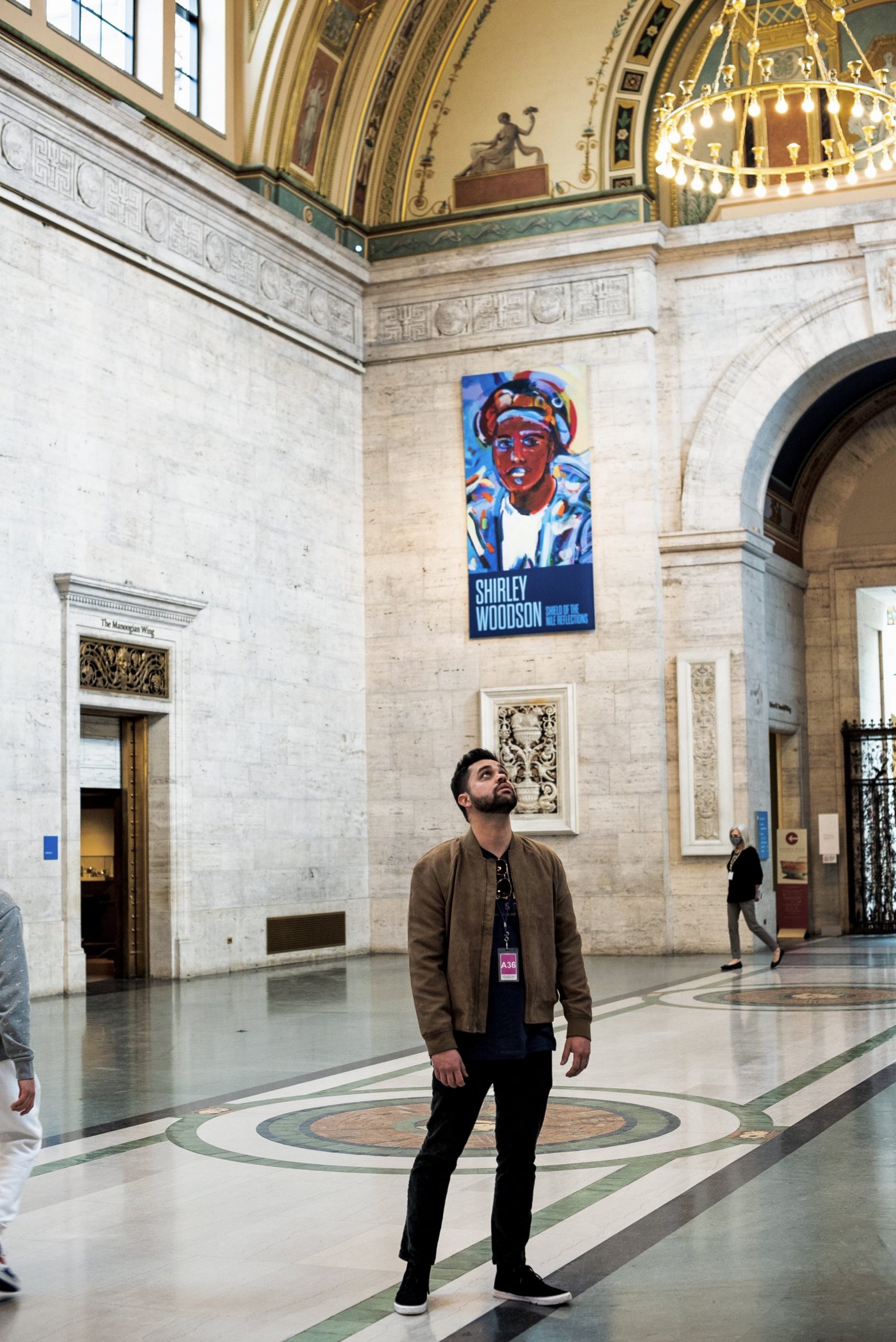
Beneath the veneer of a cultural institution lies the raw dynamics that shape it. Often the people, places and practices that are so vital to a museum’s identity play fall into the background, but we created a dia.org that incorporate an entirely new community section into its information architecture, tying the museum to it's Detroit roots and better informing the tri-county area about benefits and events available to them.
Visual Design
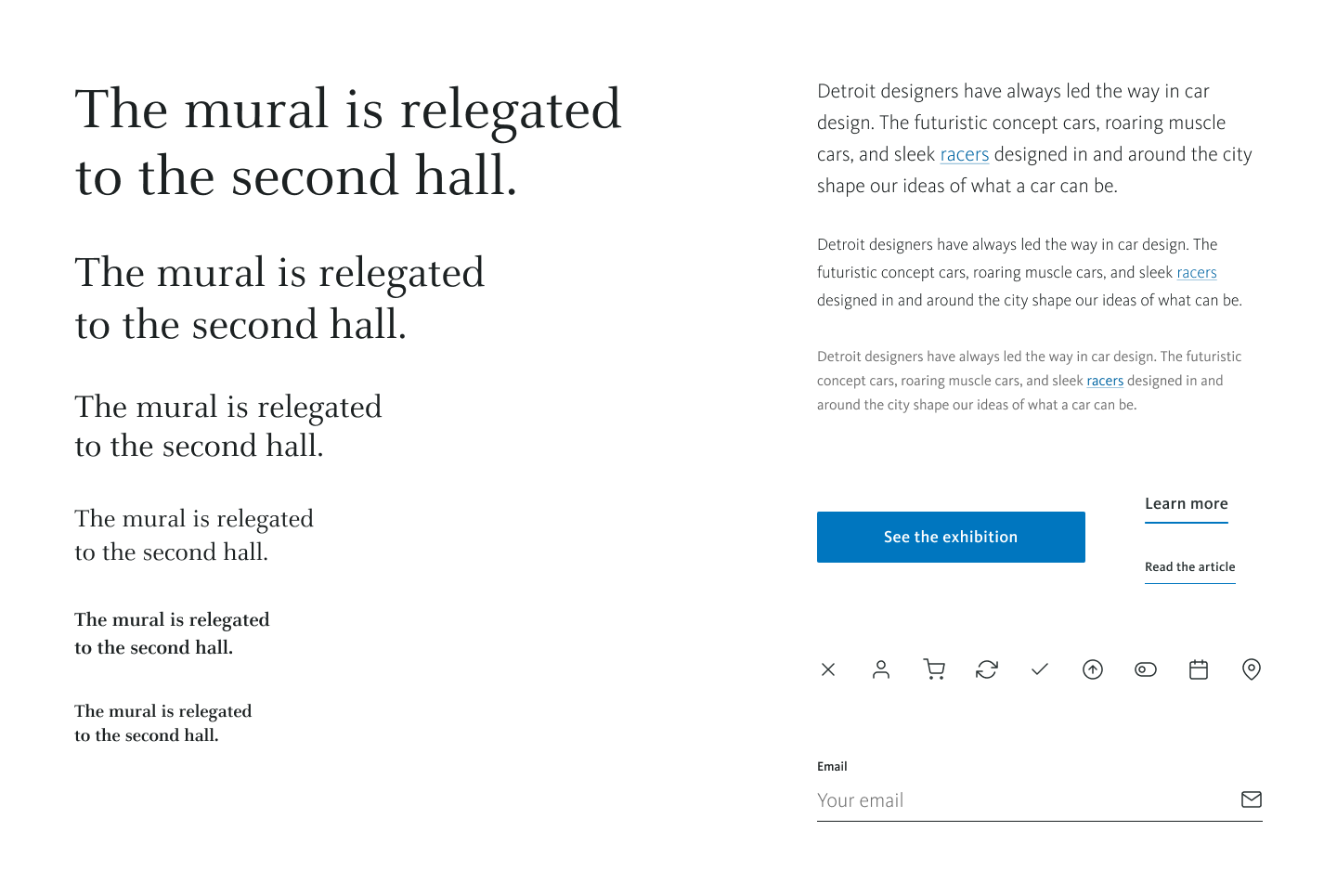
We re-thought the digital application of Pentagram's brand identity, starting with the type system built from Celeste and Kievit. We prioritized lighter weights in order to give the entire composition an airy, elevetated feel.
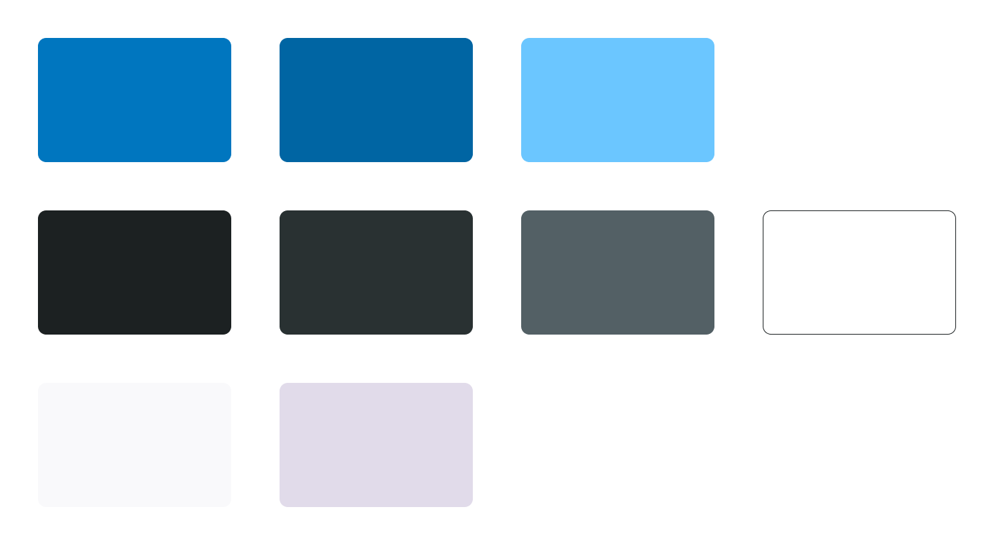
We built a new digital palette from the DIA's primary blue value, selecting compelementary neutrals and adding a new set of off-white colors that added hints of lavendar to the layout—a complementary touch the the sparing use of the signature brand color that brought depth to the minimalist design.
Motion struck a contrast between grandeur evoking reveals for imagery and quick, functional slides for hover effects.
Card hover states hit multiple points of recognition and style.
Key Moments
ART FOR EVERYONE
Reimagining the collection as a public gallery
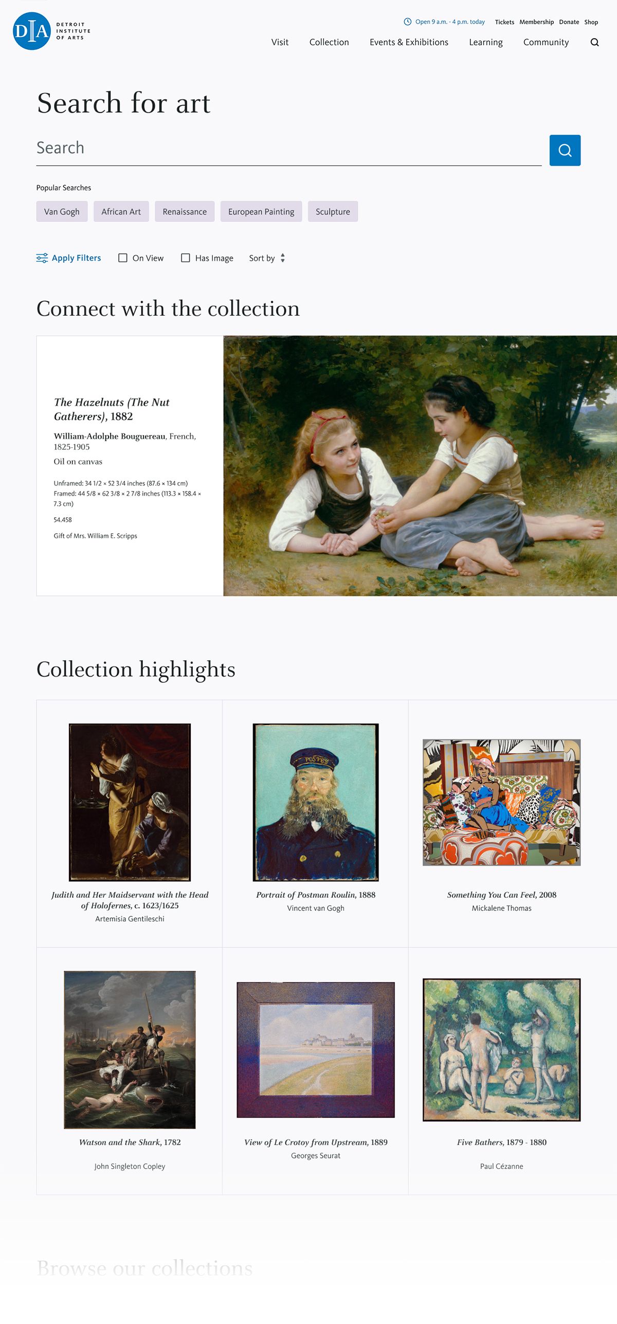
With over 60,000 works of art and diverse stakeholders from provenance and conservation experts to the general public, the DIA’s digital collection posed a significant challenge. The data lived on a separate platform with its own API, and included thousands of taxonomies and metadata points.
From the beginning, we knew the collection was the heart of this experience. We set out to create a place where the public could engage with this incredible collection, its beauty, and its history.
We designed a robust search system to help users discover works by practical filters, smart autocomplete, and guided queries. To simulate the gallery experience, we also built an inspector tool—with zoomable images and expandable tombstones—so users could explore artworks in rich, intimate detail.
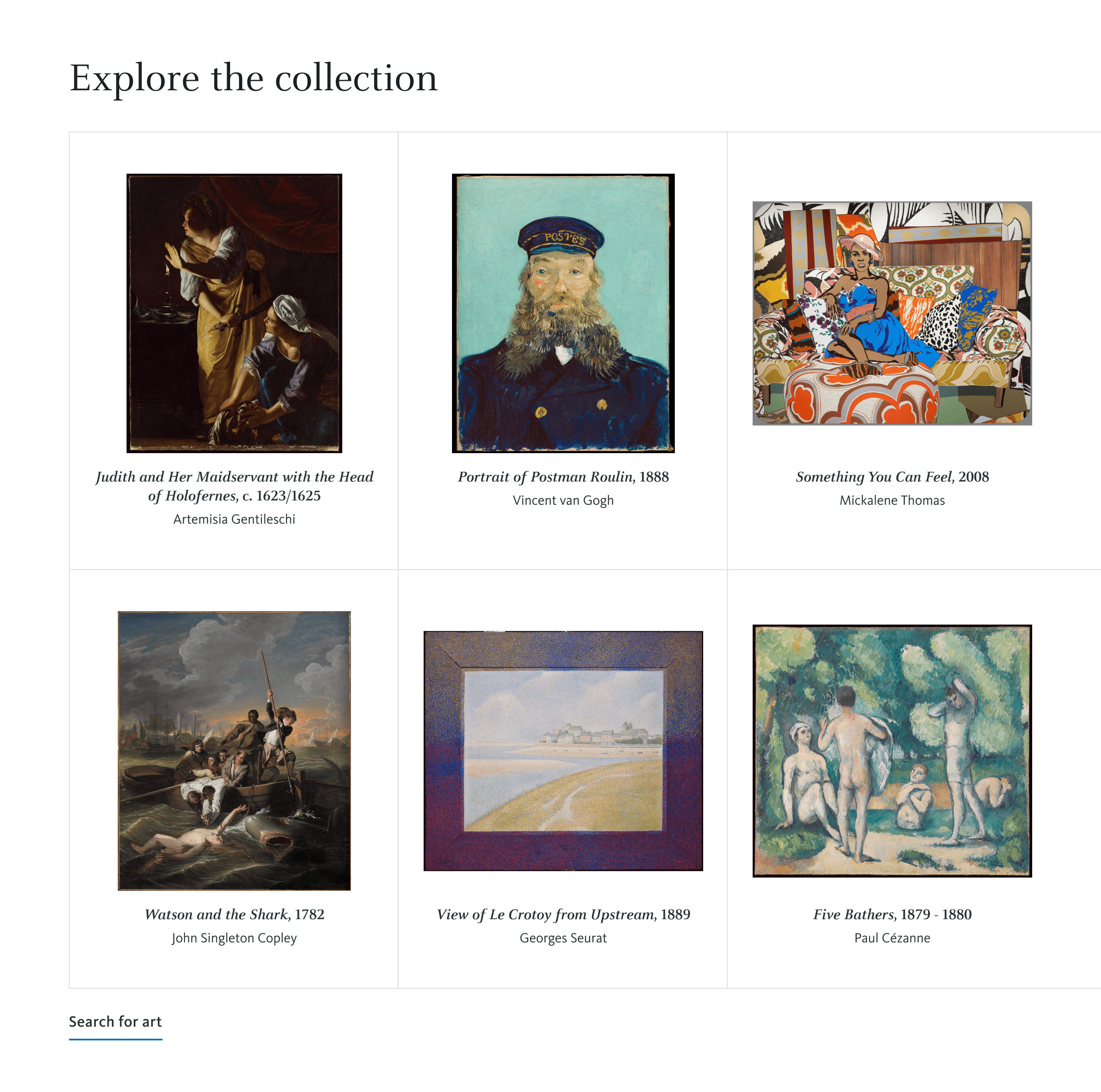
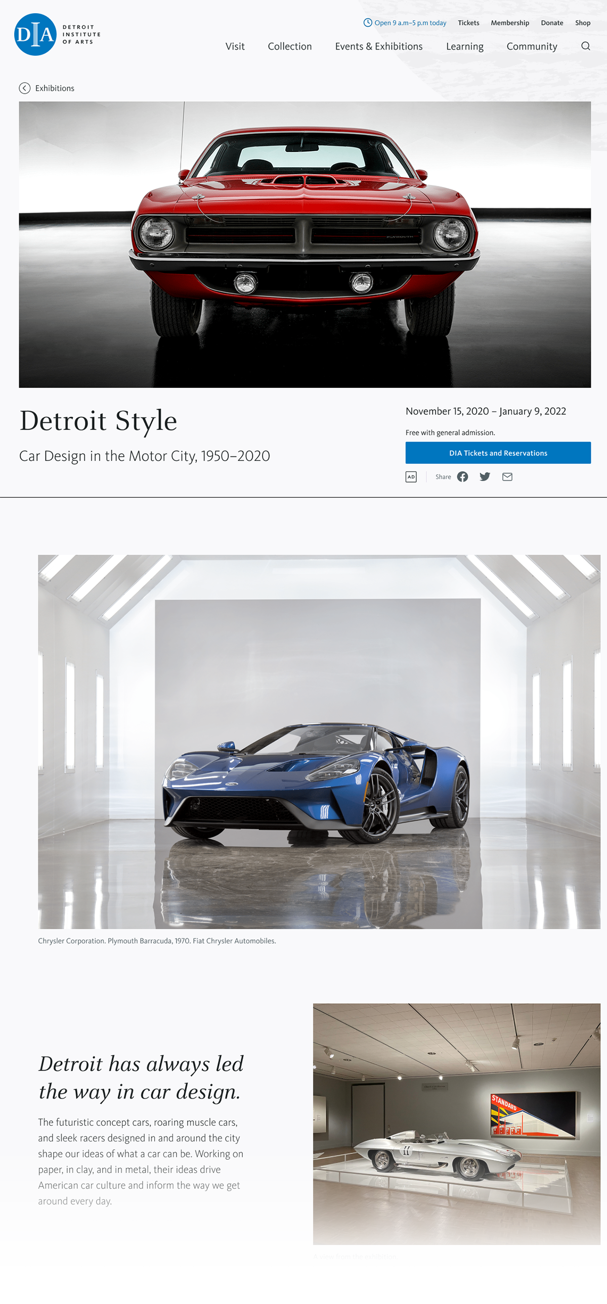
The collection grid serves as the primary way users explore art at the DIA. Clean, consistent containers with fitted images create an orderly visual experience, while artwork detail pages present each piece without distraction.
ROOTED IN DETROIT
Community, front and center
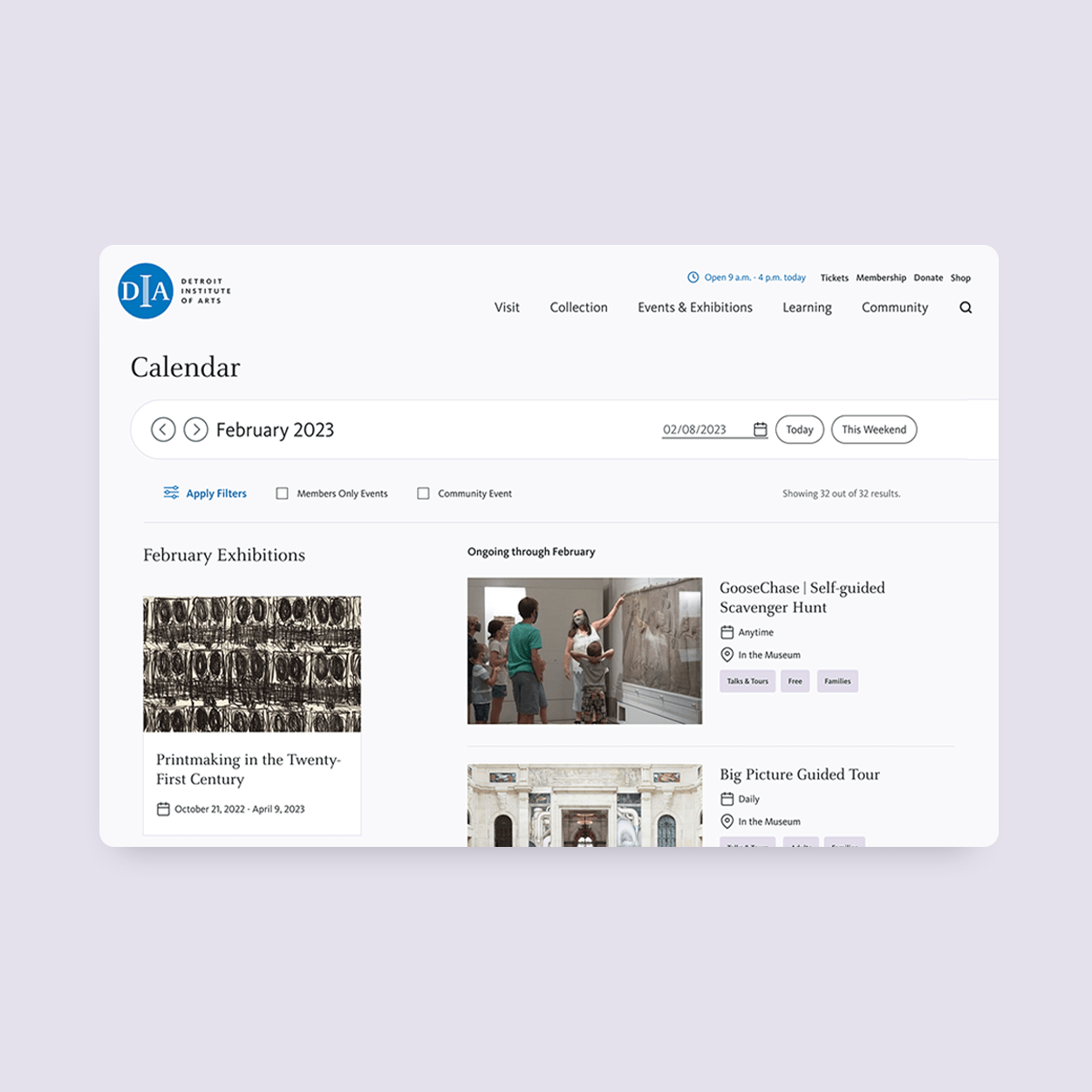
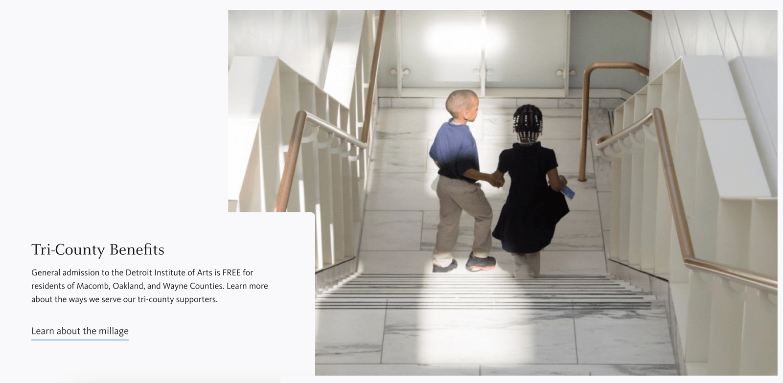
Funded by a regional millage, the DIA offers free admission and benefits to residents of Wayne, Oakland, and Macomb counties—making community a core priority in the site’s structure. We introduced a dedicated community section to highlight local benefits, events, and learning opportunities, and redesigned the calendar to make planning easier and more intuitive.
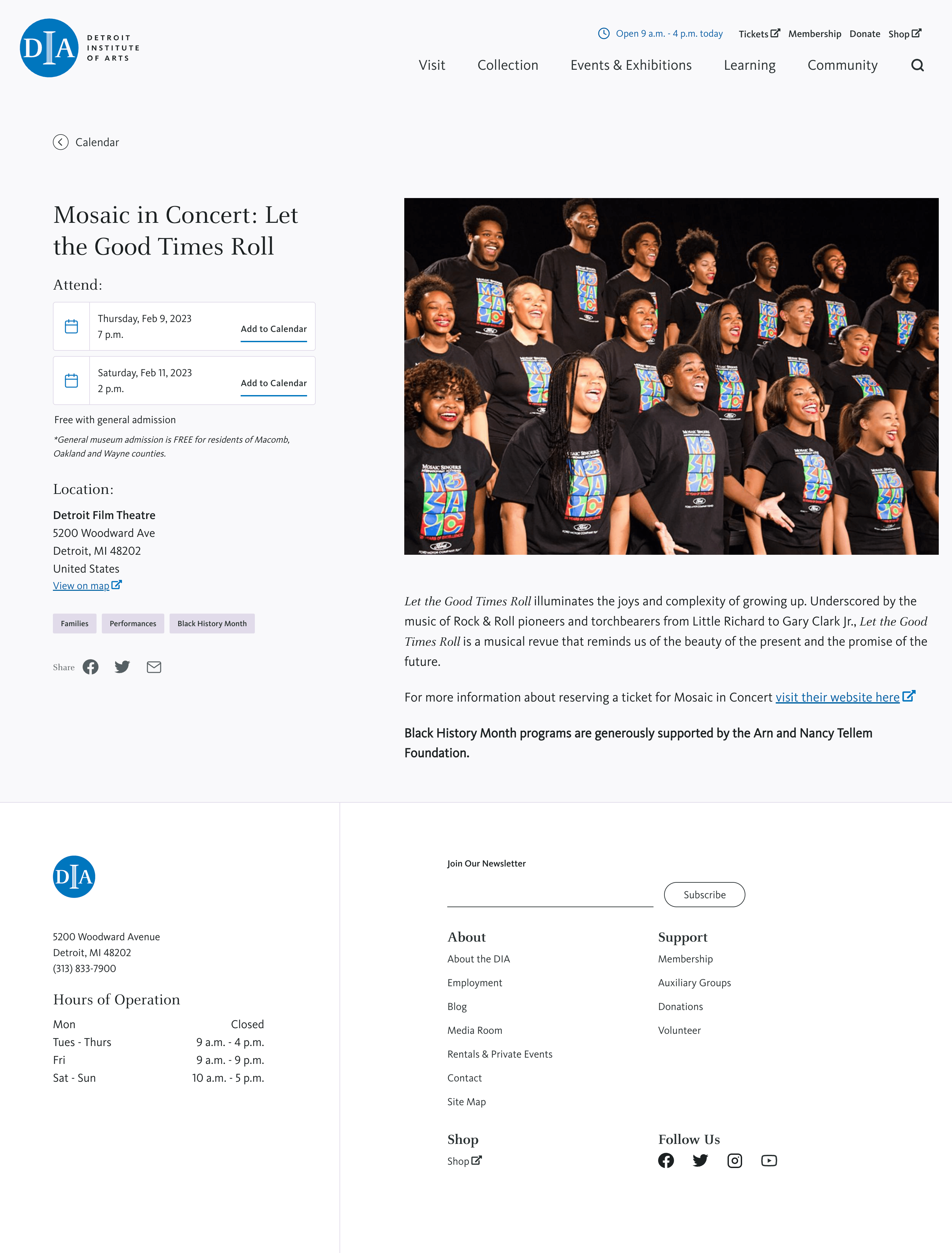
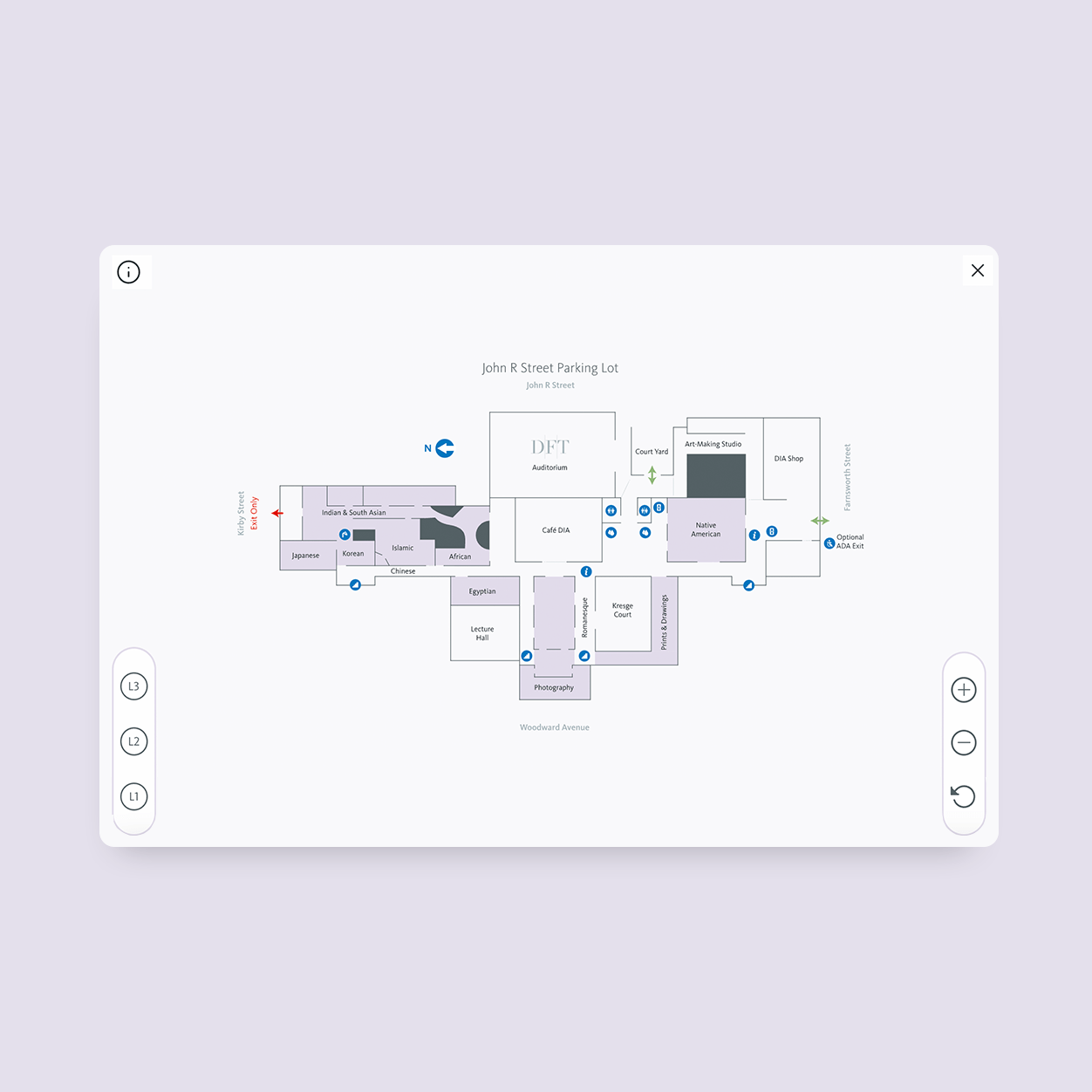
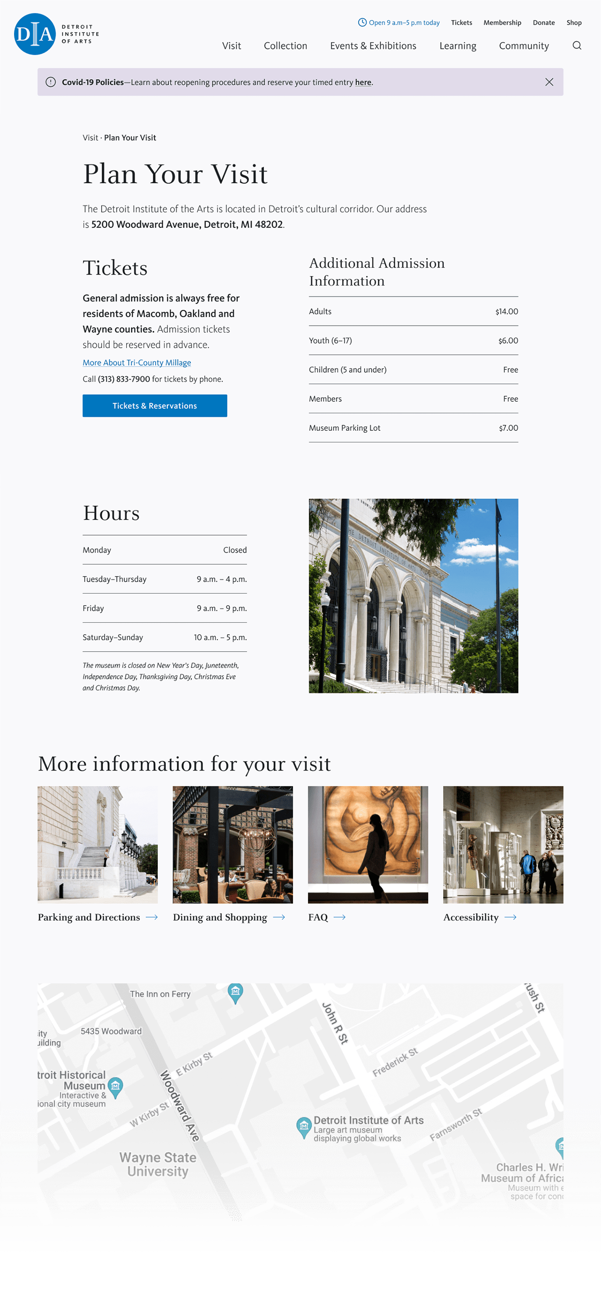
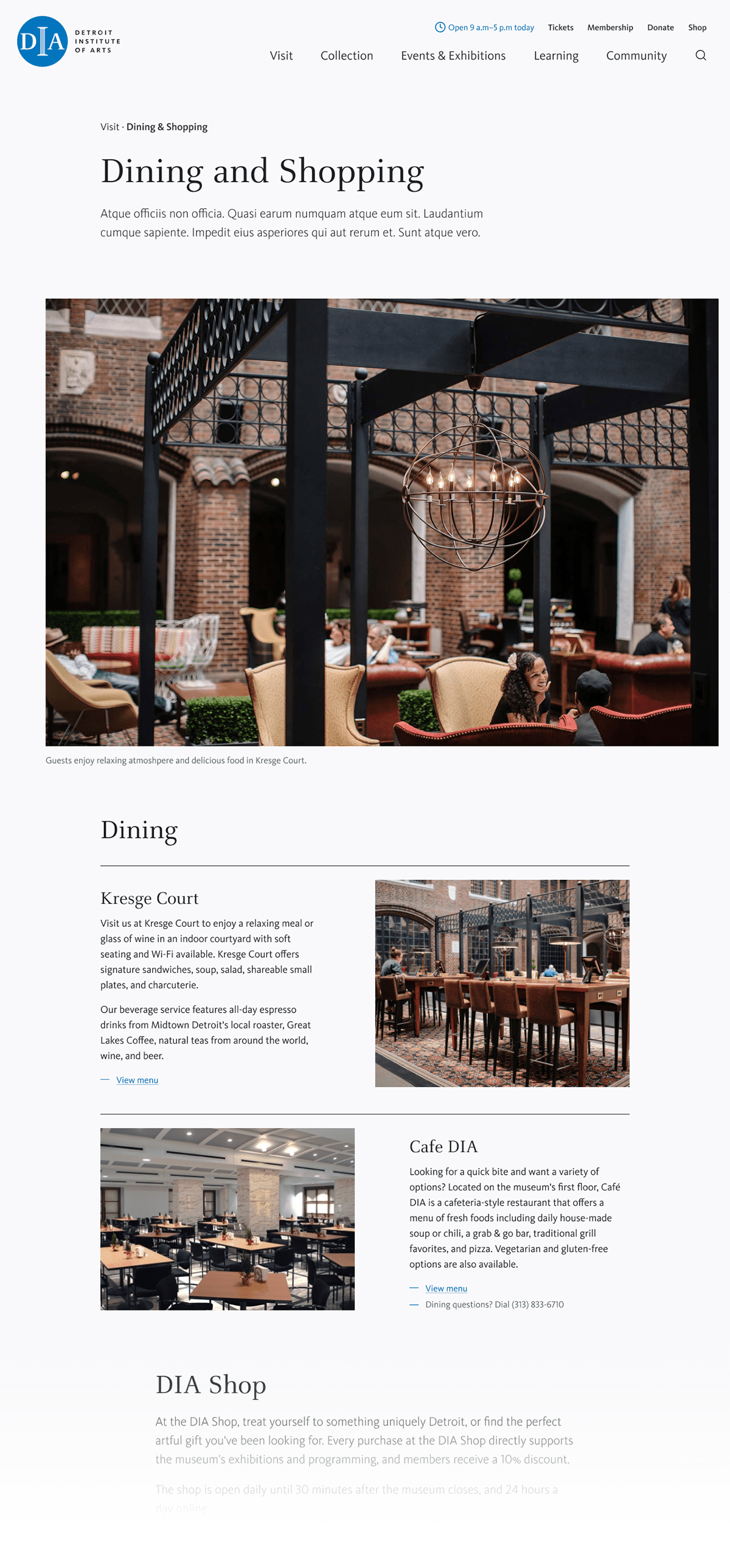
Making it easier to visit the DIA
Visit planning is essential for any cultural institution’s website. Our top priority was access—surfacing key information and removing anything that stood in the way of getting to or around the museum. We designed an interactive map, a streamlined visit planning page, and a suite of amenities pages that go beyond logistics to give users a real sense of what it’s like to be there.
Key results
49%
increase in time spent exploring DIA’s online art collection
50%
increase in traffic to plan a visit to DIA
58%
increase in traffic to DIA’s events and calendar
Previous
Next